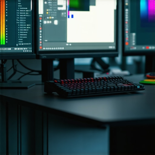
Ever spent hours tweaking a project only to realize the colors are off when viewed on a different screen? Or worse, spent a fortune on a high-end monitor that promised perfection but left you disappointed? I’ve been there. I remember my first serious upgrade to a 4K, color-accurate monitor. I thought I was making a smart choice—only to discover that not all displays are created equal. The frustration was real, and I quickly learned that choosing the right monitor isn’t just about resolution or brand name. It’s about understanding what truly matters for creative and professional work in 2025.
Why getting the right monitor is more crucial than ever
In 2025, the landscape of professional displays has evolved rapidly. Monitors are no longer just screens; they’re essential tools for accuracy, productivity, and even health. With more people working remotely and collaborating across continents, a single monitor that handles color precision and crisp detail can save you hours of rework and headaches. According to a recent study, color inaccuracies can lead to up to 20% loss in project quality, which is a huge deal for designers, photographers, and video editors. That’s why investing in a top-tier, color-accurate monitor isn’t just a luxury anymore—it’s a necessity.
But here’s the catch: with so many options flooding the market, it’s easy to get overwhelmed or buy something that doesn’t meet your actual needs. I made that mistake early on. I bought a popular model based on reviews alone, only to realize later that it lacked true color calibration capabilities. It’s a mistake I see many professionals making, and it can cost you dearly in terms of both time and money.
Today, I’ll share my personal insights and guide you through the essentials of choosing the best monitor for your creative or professional work. From resolution to color gamut, and from ergonomics to connectivity, I’ll help you cut through the noise. Whether you’re a graphic designer, a developer, or a content creator, you’ll find actionable tips and recommendations that will transform your workspace. Ready to ditch the guesswork and upgrade your setup? Let’s dive in.
What really matters in a top monitor for 2025
Before we get into specific models, it’s important to understand what features make a monitor truly stand out for professional use. Think of your monitor as a window into your creative world—so clarity, accuracy, and comfort are non-negotiable. Are you tired of staring at screens that distort your colors or cause eye strain? If yes, then you’re in the right place. We’ll explore the must-have features, common pitfalls, and how to find the perfect balance between cost and performance.
If you’ve faced issues like color mismatches or eye fatigue, don’t worry—you’re not alone. And better yet, there are solutions that don’t require an arm and a leg. Want to see some of the best options currently available? Check out our recommendations for color accurate monitors for creative pros in 2025.
Now, let’s get into the practical steps to pick your ideal monitor and avoid the common mistakes that can hold you back in your projects. Trust me, choosing the right display can make all the difference in your workflow and final output.
Set Your Priorities and Know What Matters
Before diving into specific models, clarify what features will elevate your workflow. Think of your monitor as a precision instrument—like a painter’s palette or a camera’s sensor. The core aspects you should focus on include resolution, color accuracy, refresh rate, and ergonomics. For example, I once experimented with a 4K monitor that boasted high resolution but lacked true color calibration. The result? Slight color mismatches that caused rework for my design projects, wasting hours. Once I understood the importance of color gamut and calibration, I shifted my focus and found monitors like the best color-accurate displays for 2025 that fit my needs perfectly.
Double Down on Resolution and Screen Quality
For professionals in 2025, 4K resolution is the baseline—think of it as upgrading from a standard definition TV to 4K Ultra HD. It’s like moving from a blurry sketch to a detailed painting. When selecting a monitor, prioritize models with a sharp pixel density, ideally around 150-200 PPI, ensuring crisp images and smooth text. I once upgraded my setup with a top 4K monitor for office efficiency and immediately noticed improvements in my visual clarity, which boosted my productivity and reduced eye strain.
Master Color Gamut and Calibration
Color accuracy isn’t just about having vibrant hues—it’s about precision. Look for monitors supporting at least 99% sRGB and 95% DCI-P3 color gamuts. Think of this as a painter’s palette—more colors, more accuracy. To ensure consistency, invest in hardware calibration tools like the X-Rite i1Display or Datacolor SpyderX. I once ignored calibration and was frustrated when my colors looked perfect on my monitor but off on client screens. After calibrating my display, I saw a dramatic improvement, making my workflow more reliable and professional. Check out this comprehensive guide to color calibration for more insights.
Refresh Rate and Response Time for Seamless Work
While not as critical as color accuracy for most professions, a higher refresh rate—around 60Hz to 144Hz—can make a difference in reducing eye fatigue and providing smoother interactions. For example, I started using a monitor with a 120Hz refresh rate during long editing sessions and noticed less eye strain. It’s like upgrading from a bicycle to a motorcycle—more fluid and responsive. If you’re into gaming or video editing, consider models with higher refresh rates and fast response times. For dual setups, explore dual monitor configurations that enhance productivity and reduce neck strain.
Ergonomics and Connectivity Matter
Comfort is key. Choose monitors with adjustable height, tilt, and swivel features—think of it as customizing your workspace for maximum comfort. Additionally, check for modern connectivity options like USB-C, Thunderbolt, and multiple HDMI/DisplayPort inputs. This flexibility saves you from clutter and ensures seamless integration with your devices. I once used a monitor without proper ergonomic adjustments, which led to neck and shoulder pain after hours of work. Upgrading to an ergonomic model transformed my posture and efficiency. For a detailed review of ergonomic features, see the office monitor selection guide.
Test Before You Commit
Whenever possible, visit a store or a trade show to see the monitors in action. Pay attention to how colors look under different lighting conditions and how comfortable the viewing angles are. I once ordered a monitor online based solely on specs, only to find out it had poor viewing angles that caused color shifts when viewed from the side. Testing in person can save you from costly mistakes. Many brands now offer demo units or return policies—use them. After my hands-on test, I chose a monitor that met all my criteria, and my workflow improved instantly.
Summary of Action Steps
- Prioritize resolution, color gamut, and calibration tools
- Choose ergonomic designs with flexible adjustments
- Opt for modern connectivity options like USB-C
- Test monitors in real-world conditions before buying
Many professionals and enthusiasts alike fall into common misconceptions when selecting a monitor, often based on surface-level specs or outdated advice. As someone deeply involved in display technology and professional calibration, I want to clarify a crucial nuance that many overlook: the importance of hardware calibration and color management beyond just initial factory settings. While most monitors come with factory calibration, these settings are often a baseline, not a standard, and can lead you astray if not properly adjusted.
Contrary to popular belief, a monitor’s factory calibration is not always sufficient for professional work, especially in color-sensitive fields like photography, video editing, or graphic design. Studies show that even high-end displays can drift in color accuracy within a few months of use unless calibrated regularly. For instance, a comprehensive 2022 report by industry experts emphasized that hardware calibration tools such as the X-Rite i1Display or Datacolor SpyderX are essential for maintaining true color fidelity over time. This ongoing calibration process ensures your monitor remains a reliable window into your creative world, preventing costly rework or mismatched colors.
Are factory calibration standards enough for professional work?
In my experience, relying solely on factory calibration is a rookie mistake. It’s akin to trusting a car’s odometer without regular check-ups—initially fine, but potentially misleading over time. Regular calibration aligns your monitor’s color output with industry standards like sRGB or DCI-P3, which is vital for maintaining consistency across devices and clients. Without it, your carefully crafted hues might look stunning on your screen but off on your client’s device or print. So, if you’re serious about color accuracy, investing in calibration tools and learning how to use them is non-negotiable. For more insights into calibration, check out our comprehensive calibration guide.
Another nuance often missed is the impact of ambient lighting on your monitor’s perceived color accuracy. Professional color management isn’t just about the hardware; it’s also about creating a consistent viewing environment. This includes controlling ambient light, employing proper monitor hooding, and periodically recalibrating your display. Overlooking these factors can result in color mismatches, even with a calibrated monitor, leading to frustration and inaccuracies in your final output.
So, my advice? Don’t settle for the factory defaults. Instead, treat your monitor as a precision instrument that needs regular care and calibration. This approach is the secret weapon for achieving true-to-life colors and a seamless workflow. Have you ever fallen into this trap? Let me know in the comments or reach out through our contact page.
Once you’ve selected the perfect monitor, the journey doesn’t end there. Keeping your display in top shape requires deliberate maintenance and the right tools. Over time, dust, fingerprints, and even ambient light conditions can affect color accuracy and clarity. That’s why I rely on specific equipment and routines to preserve my setup’s performance.
How do I maintain my monitor over time?
First, regular cleaning is essential. I use a microfiber cloth paired with a gentle screen-cleaning solution designed explicitly for delicate displays. Avoid harsh chemicals—they can damage coatings and affect calibration. Additionally, I calibrate my monitor every three months using a hardware calibration device like the X-Rite i1Display. This ensures color accuracy remains consistent, especially if you’re working on color-sensitive projects. I also recommend controlling ambient lighting, which can significantly influence your perception of colors. Using a dedicated monitor hood or bias lighting helps create a neutral environment, minimizing fluctuations caused by room lighting.
Beyond physical maintenance, software tools are equally vital. I use calibration software that pairs with my hardware device to generate precise ICC profiles. This pairing guarantees consistent color output. For those working in professional environments, I suggest scheduling calibration routines at least quarterly or after significant hardware or software updates. Keeping your display calibrated prevents cumulative errors, ensuring your work remains true-to-life across different devices and prints.
Tools and software I recommend for longevity
My go-to calibration device is the X-Rite i1Display. It provides precise measurements and easy-to-follow calibration workflows. For cleaning, I prefer a microfiber cloth and a specifically formulated screen cleaner—never use paper towels or household cleaners, as they can scratch or damage your display. To monitor environmental factors, I use a light meter app on my smartphone to ensure consistent lighting conditions. This small step helps me catch subtle shifts that could impact color perception.
Looking ahead, I predict that automation in calibration tools will become more prevalent. Devices will increasingly incorporate AI-driven adjustments, reducing the manual effort needed to maintain optimal display performance. Moreover, cloud-based calibration profiles could allow seamless synchronization across multiple devices, ideal for teams and collaborative projects.
If you’re serious about maintaining your monitor’s performance, I encourage you to implement a regular calibration schedule using a hardware device like the X-Rite i1Display. This investment pays off by ensuring your colors stay true over months and years, saving time and frustration. Want to boost your workflow even further? Experiment with ambient light control and consider upgrading your calibration tools periodically. It’s a small investment for long-term accuracy and peace of mind.
The Hardest Lesson I Learned About Monitor Calibration
One of my biggest realizations was that factory calibration is just a starting point—nothing more. Professionally, I used to trust factory settings completely, only to find colors drifting after a few months. The lightbulb moment came when I invested in a quality calibration tool like the X-Rite i1Display. Regular calibration became my secret to maintaining color accuracy and ensuring my work looked consistent across devices.
My Top Pick for Consistent Color Work
The best advice I can give is to choose monitors with at least 99% sRGB and 95% DCI-P3 coverage. I personally rely on models that support hardware calibration, which keeps my colors precise over time. For instance, I recommend checking out the best color-accurate displays for 2025. These tools have transformed my workflow by reducing guesswork and rework, especially in critical projects like photo editing and video production.
Creating a Workspace That Supports Your Eyes and Mind
Ergonomics isn’t just about comfort—it’s about safeguarding your vision and focus. I learned the hard way that adjustable height, tilt, and swivel are non-negotiable. Upgrading to a monitor with these features, paired with ambient bias lighting, has significantly reduced eye strain during long sessions. I also use a microfiber cloth and gentle cleaners for maintenance, ensuring my display remains pristine and reliable. For a complete setup, I suggest exploring office monitor selection tips.
Never Underestimate the Power of Testing
Before making a purchase, I always test monitors in person whenever possible. Seeing how colors appear under different lighting conditions saved me from costly mistakes. Many brands now offer demo units or flexible return policies—use them to your advantage. Once, I ordered a monitor online based on specs alone, only to discover poor viewing angles that caused color shifts. A quick in-store test or demo can make all the difference in choosing a monitor that truly fits your needs.
Unlocking the Full Potential of Your Display
Remember, a monitor is an investment in your craft. Regular calibration, proper maintenance, and creating an optimal viewing environment are key to long-term success. With the right tools and habits, your display will become an unwavering partner in your creative journey. Don’t settle for mediocrity—your work deserves the best visual foundation. Have you ever overlooked calibration? Share your experiences below and let’s learn together.
This post really hits home, especially the part about the importance of regular calibration beyond factory settings. I’ve learned from my own experience that even high-end monitors can drift in color accuracy after a few months if not properly maintained. I’ve been using the Datacolor SpyderX for regular calibration, and it’s been a game-changer for my photo editing workflow. The consistency it provides has saved me so much rework and guesswork, especially when printing or sharing files with clients.
What’s everyone’s go-to calibration routine? Do you calibrate your displays monthly, quarterly, or on a different schedule? I’d love to hear how different workflows impact calibration frequency and if anyone has tips for streamlining the process.
I completely agree with the emphasis on regular calibration and the importance of choosing monitors that support hardware calibration tools like the X-Rite i1Display or SpyderX. In my experience, a well-calibrated monitor not only ensures color accuracy but also prolongs the overall health of the display by reducing strain and preventing uneven wear. One thing I’ve found helpful is to set a quarterly calibration routine, especially if I’m working on color-critical projects. It’s interesting to note how ambient lighting can influence your perception of color accuracy—a tip I picked up is to calibrate your monitor in your typical work environment rather than a dark room, for more consistent results. How often do others here recalibrate their monitors, and have you noticed significant differences with different calibration intervals? Would love to hear insights on balancing calibration frequency with busy schedules.
This post really resonates with me, especially the parts about calibration and maintaining color accuracy over time. In my experience, investing in a good monitor is just the first step; regular calibration is essential to keep colors consistent, especially when working on projects for print or digital media. I’ve been using the X-Rite i1Display for about a year now, calibrating every three months, and it truly makes a difference in ensuring my colors stay true to my initial design. I’ve also found that environmental lighting plays a role—calibrating in the same ambient conditions as I work helps maintain accuracy.
One question I have is how others manage calibration schedules when working under tight deadlines. Do you find it feasible to calibrate quarterly, or do some prefer a more frequent routine? Also, has anyone experienced challenges with calibration tools in different lighting environments? I’d love to hear your tips on streamlining this process for busy workflows.