I still vividly remember the frustrating moment when I opened a new project, only to realize that the colors on my screen didn’t match the client’s expectations. The hues seemed off, and what was supposed to be vibrant and true to life looked dull or overly saturated. It was a lightbulb moment for me—my monitor was betraying my work. If you’re deep into creative projects or even just need an office setup that doesn’t make your task list a nightmare, this pain is all too familiar. That realization pushed me to find the *perfect* display, one that offers not just sharp images but accurate, consistent colors.
Why Getting the Right Monitor Matters More Than Ever in 2025
In today’s digital world, the monitor isn’t just a tool—it’s the window through which your work comes to life. Whether you’re designing visuals, editing photos, rendering 3D models, or simply preparing professional presentations, color accuracy can be the difference between good work and great work. But with countless options flooding the market, how do you choose? As I dove deeper into this quest, I learned that the right monitor can elevate your productivity and creativity, saving you countless hours of frustration.
According to recent studies, up to 68% of creative professionals report experiencing issues with color inconsistency across devices. That statistic underlines a simple truth: if your display isn’t calibrated correctly, your efforts could be undermined right from the start. Plus, with the advent of 4K displays and advanced panel technologies, the landscape is changing rapidly. Yet, many still settle for monitors that look good in store but fall short in delivering true-to-life colors over time.
Have you ever bought a monitor that seemed perfect on paper but let you down the moment you started working? You’re not alone. Early in my journey, I made the mistake of prioritizing resolution alone, overlooking crucial color calibration features. That oversight caused delays and rework, turning what should have been a seamless workflow into a battle against inaccurate displays.
My purpose here is to help you avoid the pitfalls I faced and to point you toward the top options designed for both creative excellence and office efficiency in 2025. Ready to find a monitor that truly matches your needs? Let’s explore how you can make a smart choice in this crowded market, and why settling for less isn’t an option anymore.
Prioritize Your Calibration Process for Precise Colors
Start by calibrating your monitor to ensure color accuracy. Use professional calibration tools like a colorimeter or a device such as the X-Rite i1Display Pro, which can meticulously adjust gamma, brightness, contrast, and color balance. I once set up my own workspace and initially relied on default factory settings, which resulted in noticeably dull hues. After calibration, images popped with true-to-life vibrancy, streamlining my editing tasks and reducing rework. Regular calibration, ideally monthly, maintains color consistency over time and guarantees your work matches industry standards.
Leverage Color Profiles and Software for Consistency
Create and apply specific color profiles tailored to your workflow. AdobeRGB or DCI-P3 profiles are excellent for creative work requiring broad color gamuts, while sRGB is standard for web content. Use calibration software like DisplayCAL or the built-in tools from your monitor manufacturer to save these profiles. During a project, I adopted an AdobeRGB color profile using DisplayCAL, which helped maintain color fidelity across various devices, preventing surprises when files were transferred. Consistently using calibrated profiles ensures accurate color reproduction, vital for professional projects.
Choose the Right Panel Technology for Reliable Color
Opt for IPS panels over TN or VA for superior color accuracy and viewing angles. IPS panels like those found in models reviewed at [the top color accurate monitors](https://monitors.techdeskessentials.com/best-color-accurate-monitors-for-creative-professionals-in-2025) deliver consistent hues even when viewed from different positions. I once used a VA panel for my design tasks, but the colors appeared washed out when not directly facing the screen. Switching to an IPS-based monitor vastly improved my color precision and collaboration with clients who required consistent visual standards.
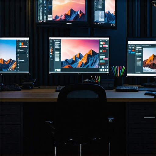
Implement Multiple Monitors for Seamless Workflow
Set up dual or multi-monitor configurations to enhance efficiency. Use the [dual-monitor setup ideas](https://monitors.techdeskessentials.com/dual-monitor-setup-ideas-to-boost-productivity-in-2025) to position your primary color-sensitive workspace on the calibrated screen and secondary tasks on auxiliary displays. I arranged my color-critical applications on a calibrated IPS monitor and used a secondary monitor for references, emails, or chat. This setup minimizes switching tabs and maximizes focus, translating into quicker turnaround times. Properly arranged multi-monitor systems can streamline complex tasks, saving hours weekly.
Optimize Lighting and Environment for Accurate Viewing
Ambient lighting plays a crucial role in perceiving true colors. Avoid harsh overhead lights or direct sunlight reflecting on your screen. Use neutral-colored walls and blinds to control natural light. During my own setup, I added bias lighting behind my monitor—soft LED strips that reduce eye strain and enhance contrast perception without affecting color accuracy. A consistent environment ensures your calibration holds true and that colors appear as intended across different light conditions.
Regularly Validate Your Setup with Industry Standards
Periodically compare your display’s output against industry-standard test images and reference materials. Use online tools like Lagom LCD test pages or software-based color validation to identify drifts or inaccuracies. I found that even after calibration, environmental factors over months affected my display. Routine checks allowed me to recalibrate or adjust settings promptly, maintaining workflow integrity. Validating your setup frequently keeps your work reliably aligned with professional expectations, reducing costly revisions.
Many assume that selecting a color-accurate or 4K monitor is straightforward, but the truth is, the market is riddled with misconceptions and overlooked nuances that can sabotage your workflow. For instance, a common myth is that a high-resolution display automatically guarantees color fidelity. In reality, resolution alone doesn’t ensure accurate color reproduction; panel technology and calibration processes play crucial roles. Relying solely on factory presets often leads professionals astray, as many consumer-grade monitors lack proper factory calibration or support features like wide-gamut color profiles. Moreover, many users overlook the importance of environmental factors; ambient lighting and screen positioning significantly influence perceived color accuracy and comfort, yet they are seldom addressed in buying guides. Choosing a display solely based on specifications like refresh rate or size might seem practical, but neglecting calibration options or color consistency across different setups can cause inconsistent workflows, especially in creative tasks requiring precise hues. An often-overlooked aspect is the danger of rapid panel aging or backlight degradation, which gradually shifts color output over time if the monitor isn’t designed with longevity in mind. This subtle drift can undermine long-term color grading or design projects, yet many users don’t perform regular validation against industry-standard test images, risking compromised quality. For professionals aiming for flawless color representation, understanding the difference between various panel technologies—IPS, VA, TN—is vital, as each has nuanced advantages and limitations in contrast, viewing angles, and color stability. IPS panels, for example, are favored for their consistent color and wide viewing angles, but they can suffer from color shifting under prolonged use if not properly calibrated or if inferior models are chosen. Also, many overlook the importance of hardware calibration tools like colorimeters for maintaining accuracy over years of use. External calibration ensures your monitor remains within industry color standards, a fact substantiated by studies from color science experts emphasizing the necessity of regular calibration for pro-level accuracy. When integrating dual monitors or upgrading to a 4K setup, many underestimate the complexity and potential for mismatched color output, which can hamper seamless workflows. Synchronizing color profiles and ensuring consistent calibration across multiple displays demand careful planning and ongoing management. The key takeaway is that choosing the right monitor extends beyond specs; it involves understanding nuanced factors like calibration support, panel technology, environmental setup, and long-term stability. For a comprehensive guide on top options tailored for creative professionals and demanding office environments, check our curated list of the best monitors for 2025. Have you ever fallen into this trap of oversimplifying monitor selection? Let me know in the comments, and I’ll be happy to help you refine your setup. For personalized assistance or questions on calibrating your display for peak performance, feel free to contact us.Maintaining a high-caliber color-accurate monitor over time requires deliberate tool choices and consistent routines. Personally, I rely heavily on calibration devices like the X-Rite i1Display Pro because of its precision and reliability; it consistently brings my display back into color harmony after months of use. Using such hardware ensures your monitor remains within industry standards, especially important when accuracy is non-negotiable for creative work. Software solutions like DisplayCAL also play a crucial role—they allow me to create, store, and apply calibration profiles tailored to different workflows, whether editing photos or preparing presentations. Regular recalibration—ideally once a month—is vital to compensate for panel aging and environmental shifts. This routine keeps color drift in check and maintains workflow consistency. Predicting where this is heading, I believe automated calibration tools integrated into monitors or software will become more prevalent, simplifying long-term maintenance and ensuring ongoing accuracy without much manual intervention.
How do I maintain color accuracy over time?
Adopting a strict calibration schedule combined with the right tools is key. Set reminders to recalibrate using your dedicated device and software, and always calibrate in consistent lighting conditions. Regular validation with industry-standard test images (like those from the Lagom LCD test pages) can help you catch subtle shifts before they impact your work. Remember, even premium displays can drift, and staying vigilant ensures your work remains true to its intentions. If you’re serious about keeping your setup in tip-top shape, I highly recommend investing in a quality calibration device and making it a monthly ritual. For expert guidance on selecting the best tools, check out the best color accurate monitors for 2025. Don’t just take my word for it—give this advanced tip a try and see how consistently precise your colors stay. Remember, proactive maintenance today ensures your creative projects look exactly as envisioned tomorrow.
What I Wish I Knew Before Picking My Display
One of the most challenging lessons I learned was the importance of investing in an external calibration device early on. Relying solely on factory presets or built-in calibration tools might seem convenient, but over time, I realized that this approach leads to subtle color shifts that can sabotage professional projects. It took me months of rework and second-guessing to understand that precision tools like the X-Rite i1Display Pro are game-changers, saving time and preserving the integrity of my work. This insight pushed me to prioritize long-term accuracy instead of short-term convenience.
My Secret Weapon for Color Consistency
Creating custom color profiles tailored to my workflow has transformed my creative process. I trust software like DisplayCAL because it empowers me to fine-tune my monitor and maintain consistent hues across projects. Using profiles like AdobeRGB or DCI-P3, I ensure that what I see on my screen reflects industry standards, reducing surprises when files are shared or printed. This consistent calibration routine has become a cornerstone of my daily workflow, instilling confidence in every project I undertake.
Why Not All Monitors Are Created Equal for Creative Work
Choosing a panel technology made a huge difference. IPS panels offer vibrant, accurate colors and wide viewing angles that TN or VA panels often can’t match. Initially, I overlooked this detail, which led me to settle for less, only to experience washed-out hues and color shifts from different angles. Upgrading to an IPS-based monitor brought my work to life, ensuring my color accuracy remains intact regardless of my position in front of the screen. This decision significantly improved my output quality and client satisfaction.
Embracing Regular Validation as a Creative Discipline
Performing routine validation with industry-standard test images has become an almost meditative part of my process. It’s simple yet powerful—test images reveal subtle drifts or inaccuracies that can creep in over months. By catching these early, I recalibrate or adjust settings proactively. This discipline keeps my work precise, my colors true, and my reputation intact. It’s a small investment of time that yields massive returns in quality and peace of mind.
One Unexpected Insight That Changed Everything
Ambient lighting and environment matter more than I initially believed. I used to work in a brightly lit room, thinking my monitor’s brightness was enough. But I soon discovered that controlled lighting, like bias lighting behind my monitor, enhanced my perception of color nuance and reduced eye strain. That simple change helped me see colors more accurately and work comfortably for longer hours. A mindful workspace environment is perhaps the most underrated secret for consistent, high-quality visual work.
Curated Tools for Elevating Your Display Experience
- X-Rite i1Display Pro — This calibration device has proven invaluable for maintaining industry-standard accuracy over years. Its precision and ease of use have made calibration routine effortless and reliable.
- DisplayCAL Software — I trust this open-source tool for creating detailed color profiles. It offers customization options that adapt perfectly to diverse workflows and monitors.
- Lagom LCD Test Pages — These free online tests help me verify my monitor’s performance regularly, catching even the smallest inaccuracies before they affect my work.
- Ambient Bias Lighting — Adding soft LED backlights creates consistent lighting conditions, making color perception more stable and reducing fatigue during long sessions.
Your Next Step in Color Confidence—Start Today
Taking charge of your monitor’s accuracy is a commitment that pays dividends in quality, efficiency, and peace of mind. Remember, the magic isn’t just in choosing the right monitor, but in continuously maintaining its calibration and environment. Whether you’re working on professional design, photo editing, or just want your office setup to shine, mastering your display elevates your entire workflow. Ready to transform your work by unlocking true-to-life colors? The journey begins with a simple calibration routine—start now, and see the difference it makes. Have you ever dedicated time to calibrating your display? Share your experience below—I’d love to hear your story.
Reading this post really resonated with my own experience. I used to rely solely on factory settings when setting up my workspace, and I wonder how many others do the same without realizing the impact on color fidelity. The moment I invested in an external calibration device like the X-Rite i1Display Pro, everything changed—colors became consistently accurate, and I could trust my monitor for professional work. The routine of recalibrating once a month is such a small effort but makes a huge difference over time. I especially appreciate the emphasis on environmental factors; controlling ambient lighting has helped me reduce eye strain and improving color perception. Do you find that certain lighting conditions are better for calibration or for working long hours? Sharing your tips could help others avoid common pitfalls and save time and frustration.
Your post hits the core of why I recently decided to upgrade my monitor. I used to overlook calibration altogether, thinking resolution and size were enough for my graphic design projects. But I started noticing subtle color shifts after a few months, which affected my work’s consistency. After investing in a calibration device like the X-Rite i1Display Pro and following a strict monthly routine, I’ve seen a significant improvement in color fidelity. It’s fascinating how much environmental factors, like ambient light, can influence perceived color accuracy. I now use bias lighting behind my monitor, and I find it helps my eyes and maintains color consistency even during long editing sessions. My question is, have you ever found a particular type of lighting setup that helped you even more? Or do you think more advanced monitors with built-in calibration sensors might soon make all this manual effort unnecessary? I’d love to hear other users’ experiences about balancing setup routines and technology, especially for long hours of creative work.