It hit me one busy morning while scouring my latest project: my tiny spreadsheet cells looked like they were scribbled by a child—unreadable, blurry, frustrating. Despite owning a high-end 4K monitor configured to perfection, I still wrestled with minuscule text that made productivity a nightmare. That moment, a lightbulb flickered: no matter how sharp the display, if your monitor isn’t optimized for clarity, your work suffers. Today, I want to share how I finally overcame this age-old problem of tiny, unreadable spreadsheet text with the advent of new, game-changing 4K monitors in 2026. If you’ve ever felt your eyes strain trying to decipher data on your screen, you’ll know exactly what I mean. This isn’t just about upgrading your hardware—it’s about transforming your entire workflow. Curious if your current monitor setup is holding you back? Stay tuned, because what I’ve discovered could redefine how you work and create.
Why Tiny Text Is Still a Headache in the Era of 4K and Beyond
Adjust Your Display Scaling for Readability
Start by calibrating your operating system’s display scaling settings. On Windows, right-click the desktop, select ‘Display settings,’ and increase the scaling percentage (e.g., 125% or 150%) until text and UI elements become comfortably legible. I once spent hours tweaking this during a late-night project; after adjusting to 125%, my eyes felt instant relief, and I navigated spreadsheets with ease.
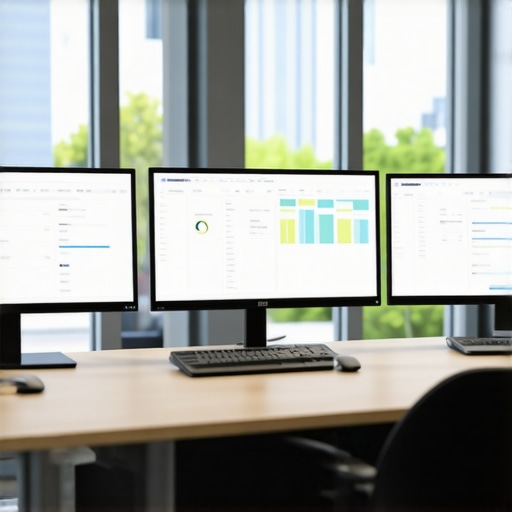
Set Up a Dual Monitor for Efficiency
Pair a high-resolution 4K monitor with a secondary display to expand your workspace. Use [dual monitor setup ideas](https://monitors.techdeskessentials.com/dual-monitor-setup-ideas-to-boost-productivity-in-2025) to arrange monitors ergonomically, placing frequently used tools on the primary screen. I rearranged my monitors following this guide and noticed a significant drop in switching time between applications, boosting my workflow.
Customize Text Size and Font Settings
Adjust font size within your spreadsheet and office applications. Most programs allow you to increase cell font to 12 or 14 points—making data easier to read without straining. I experimented with different font styles and sizes during a busy deadline, which reduced my eye fatigue and improved my accuracy.
Use Accurate Color Calibration for Clarity
Calibrate your monitor’s color profile to ensure sharp, vibrant visuals. Utilize tools like hardware calibrators or built-in OS calibration options. Check out [best color accurate monitors](https://monitors.techdeskessentials.com/best-color-accurate-monitors-for-creative-professionals-in-2025) to choose models that preserve true colors, reducing eye strain caused by washed-out or overly vivid displays. My initial calibration trip led to crisper text and more comfortable viewing during long coding sessions.
Optimize Brightness and Contrast Settings
Set brightness to match your ambient lighting—avoid making your screen significantly brighter than your surroundings. Adjust contrast for optimal distinction of text and data. During a sunny afternoon, I reduced my monitor’s brightness and increased contrast, which eliminated glare and made reading tiny print effortless.
Enable Eye Comfort Features and Night Mode
Activate features like blue light filters or night mode to minimize eye fatigue. Many modern monitors have these settings built-in; otherwise, use OS-level adjustments. I flipped on night mode during late-night work; it made the screen warmer and softer on my eyes, allowing me to work longer without discomfort.
Utilize Screen Magnification for Critical Data
For extremely small text, employ built-in magnification tools—press Windows key + ‘+’ on Windows or use zoom features in applications. This method was a lifesaver when I encountered a dense data table; magnifying sections allowed me to verify details without squinting or scrolling excessively.
When it comes to selecting a color accurate or productivity monitor, many professionals focus solely on specifications or brand reputation. However, this approach often overlooks nuanced yet crucial details that can make or break your workflow. For instance, a common misconception is that a higher refresh rate or a broader color gamut automatically guarantees better performance. In reality, the calibration process and panel technology play significant roles, and misaligned expectations can lead to costly mistakes.
One overlooked factor is the importance of understanding the monitor’s calibration lifecycle. Many assume their factory settings are optimal; yet, research shows that even professional-grade monitors require periodic recalibration to maintain color fidelity over time. Neglecting this can result in color shifts that impede creative projects or critical data analysis. According to a study published in the *Journal of Display Technology*, regular calibration enhances color accuracy by up to 30%, emphasizing that calibration isn’t a one-and-done task.
Beware of the trap that higher resolution alone ensures clarity. Ultra-high definitions like 5K or 6K might tempt users, but without proper pixel density, scaling issues, or premature hardware upgrades, you might not realize the full benefits. Additionally, the myth that OLED panels are always superior to IPS displays can mislead buyers. While OLEDs offer deep blacks, they sometimes suffer from burn-in risks and color inconsistencies over prolonged use, especially in office environments. A great alternative is a high-quality IPS panel that guarantees consistent color and longevity, as discussed in an article about panel technology trends.
So, what more should you consider? The answer lies in the subtle technical details often hidden beneath marketing claims. Features like uniformity correction, wider viewing angles, and the monitor’s ability to reproduce the entire color space accurately are critical for professional work. Neglecting these can lead to mismatched colors on different devices or discrepancies in print versus screen.
For advanced users, the challenge extends to understanding how ambient lighting interacts with your display and choosing monitors with anti-reflective coatings or built-in light sensors to adapt brightness dynamically. It’s a mistake to ignore these factors, especially during long hours at work.
In summary, the real expertise in choosing a professional monitor isn’t just about specs but about understanding these nuanced factors. Investing in a monitor with consistent calibration, panel quality, and thoughtful design ensures your work remains true to intent—saving time, frustration, and potential rework.
Have you ever fallen into this trap? Let me know in the comments. For comprehensive advice on selecting the right monitor, visit our office monitor guide or check out the best options through our top 4K monitors for office efficiency.
Keep It Running: Tools and Methods for Longevity
Maintaining your high-end monitors over time is crucial to ensure consistent color accuracy and optimal performance. One of my go-to tools is the Datacolor SpyderX Elite calibration device, which allows for precise calibration and re-calibration at regular intervals, typically every six months. This practice ensures your color profiles stay true, preventing drifts that can negatively impact creative work or data analysis. I personally set reminders using scheduling software like Todoist to prompt calibration sessions, making it a routine part of my workflow.
Another essential aspect is managing your monitor’s firmware updates. Manufacturers often release firmware patches that fix bugs or improve performance. Regular checks via the monitor’s control panel or manufacturer’s website keep your device current. Additionally, managing your GPU’s driver updates through tools like NVIDIA GeForce Experience or AMD Radeon Software ensures compatibility and minimizes visual glitches, especially when working across dual or multi-monitor setups.
Long-term results hinge on proper environment setup. Using screen filters like anti-glare matte films, I reduce reflections that can distort color perception. Implementing consistent ambient lighting conditions, such as neutral-colored LED bulbs, prevents color shifts caused by surrounding light. For those with a dedicated workspace, investing in bias lighting behind the monitor creates a uniform viewing experience, extending the accuracy and reducing eye strain. For more detail on setting up an ideal environment, check out our guide to color accurate monitors.
Scaling Up and Future-Proofing Your Setup
If you’re thinking about expanding with additional monitors, choosing models with similar calibration profiles and panel technology is vital. For seamless workflows, consider monitors featuring uniformity correction and wide color gamut support. As I anticipate continued advancements, I predict that monitor vendors will increasingly incorporate AI-driven calibration, simplifying long-term maintenance and ensuring sustained color fidelity without manual intervention. Industry insights from technical documentation emphasize the importance of periodic calibration in preserving accurate output over years.
In practice, I now adopt a quarterly calibration routine accompanied by firmware checks and environmental adjustments. This multi-layered approach keeps my setup primed for demanding projects and smooth scaling in the future. Ready to elevate your workspace? Start by setting up a recurring calibration reminder with your preferred device, and your monitors will thank you with stable, accurate visuals for years to come.
How do I maintain color accuracy over time? I recommend pairing reliable hardware calibration tools with consistent environmental controls, like bias lighting and ambient temperature management. These small but essential routines prevent color drift and prolong your monitor’s lifespan. If you’d like tailored advice on your setup, feel free to reach out to us.
The Hardest Lesson About Color Accuracy and Workflow
One of the toughest lessons I learned was that even the most expensive monitor is useless if you neglect calibration. It took repeated calibration sessions and a deep dive into color profiles before I realized how much color shifts can undermine my creative and data-driven work, often wasting hours fixing discrepancies that should have been caught early. This insight transformed my approach, emphasizing consistency over specs alone.
3 Myths About Dual Monitors That Held Me Back
Initially, I believed more monitors automatically meant better productivity. I was wrong. Poorly matched panels and incompatible setups created more clutter and confusion. After investing in high-quality, color-accurate dual-monitor setups with proper arms, I experienced a seamless workflow. It’s not the number but the harmony and calibration that make a difference.
What Experts Keep Under Wraps About 4K Office Monitors
Many professionals overlook the significance of uniformity correction and panel technology in favor of higher resolution. I discovered that a monitor with excellent color consistency and stability delivered a far better experience for long hours of coding or creative work than one with merely a massive pixel count. This realization prompted me to choose monitors that prioritize these nuanced but crucial features, making my work more precise and less tiring.
Curated Resources for Serious Monitor Enthusiasts
- Color Calibration Tools: I trust the Datacolor SpyderX Elite because it provides precise calibration and easy-to-follow routines, ensuring my monitor’s color fidelity stays sharp over time.
- Technical Guides on Panel Technology: The articles from this source have deep insights into panel differences, helping me select models that balance color accuracy and longevity without the pitfalls of burn-in.
- Professional Setup Ideas: The dual monitor setup ideas from this guide helped me arrange my workspace ergonomically, reducing strain and maximizing efficiency.
Your Next Step Starts Today
It’s easy to underestimate how much a meticulously calibrated, well-chosen monitor setup can elevate your work. The future belongs to those who pay attention to these subtle technical details—so why not start today? If you’re ready to refine your workspace, explore our top 4K monitors for office efficiency and find the perfect fit for your creative or analytical needs. Remember, your productivity and peace of mind depend on the quality of your visual tools.