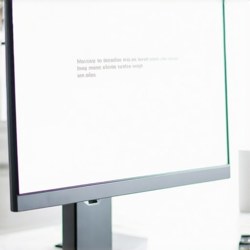
The first time I sat down after hours of tweaking my new 4K monitor, I looked at my spreadsheets and creative projects only to be greeted by fuzzy, nearly unreadable text. It was a frustrating moment—like trying to read fine print through frosted glass. I knew my upgrade supposed to boost productivity and clarity, but instead, I felt like I was wasting my investment. That lightbulb moment prompted me to dig deeper into my monitor’s settings, and let me tell you—there are secret adjustments that can make your text razor-sharp. Today, I want to share how you can transform your display with just a few tweaks, making that expensive 4K screen truly worth every penny.
Why Your 4K Monitor Might Be Failing to Impress in 2026
Is Your Display Truly Optimized or Just Bulking Up Pixels? It’s Time to Get Real
Early in my journey, I made a common mistake: I assumed that a 4K resolution was enough to guarantee crisp text and vibrant colors. Unfortunately, I didn’t realize that many monitors, especially those marketed as “budget” options, come pre-configured in ways that compromise clarity. Without manually adjusting things like scaling and sharpness, I was drowning in blurry fonts and washed-out images. It wasn’t until I started experimenting with hidden settings that I uncovered a world of difference, and I want you to experience that too. If you’ve ever felt that your high-end monitor is underperforming, you’re not alone—and the good news is, there are tweaks that can fix this.
One striking fact I came across is that many professional colorists and designers prefer calibrated settings that are often hidden from the default menus. They understand that to get true clarity, you need to go beyond just plugging in your monitor and letting it run. That’s why I’ve compiled the top 7 settings in my blog, designed specifically for 2026’s cutting-edge displays, to help you achieve maximum sharpness and clarity.
Thinking about whether these adjustments are worth the effort? Let me assure you—this isn’t just about aesthetics. Clearer text reduces eye strain, boosts productivity, and makes complex tasks like coding or graphic design much more comfortable. If you’ve faced issues like blurry spreadsheets or font jags in your office setup, I’ve been there, and I’m here to help. To improve your workspace further, check out our guide on choosing the ideal office monitor.
Now, let’s dive into those secret settings—many of which might be tucked away or labeled differently—to unlock the true potential of your 4K display.
Calibrate Your Display Settings for Sharpness
Start by accessing your monitor’s on-screen menu, usually via physical buttons on the bezel, and locate the sharpness setting. Turn it up gradually while viewing a detailed text or image; I once increased sharpness on my 4K display until the font edges looked crisp, resembling ink on paper. Be cautious—over-sharpening can introduce halos and artifacts, so aim for a natural look similar to printed material or well-calibrated professional displays.
Adjust Scaling for Text Clarity
If your text appears blurry or jagged, check your operating system’s scaling settings. On Windows, navigate to Settings > System > Display, and experiment with scaling percentages—commonly 150% or 175% for 4K screens—to ensure text remains readable without fuzziness. I had a cluttered desktop at 100%, but after setting scaling to 150%, text became unmistakably clear without compromising workspace space.
Use ClearType or Color Calibration Tools
On Windows, run the ClearType Text Tuner. It prompts you through a series of displays to pick the clearest text samples, fine-tuning font rendering. For more precise color accuracy and contrast, professional creatives should consider calibration hardware like a colorimeter, which adjusts gamma, white point, and ICC profiles to match industry standards. In my case, applying a calibration profile dramatically reduced eye strain during long editing sessions.
Optimize Brightness and Contrast
Set brightness so that white is truly white under your environment’s lighting—avoid eye strain or glare. Adjust contrast to make details in shadows and highlights pop without losing color fidelity. I once kept my monitor excessively bright, which caused fatigue; lowering brightness and fine-tuning contrast made for a more comfortable viewing experience. Remember, ambient lighting impacts these settings; a dim room requires different adjustments than a bright office.
Explore Advanced Color Settings for Creativity
If you use your monitor for professional work—like photo editing or graphic design—activate preset color modes or manually set RGB levels. Engaging these options can help you see what clients will see, especially if color accuracy is critical. For my work, I used Adobe RGB profiles and adjusted gamma to match my workflow, resulting in more reliable color reproduction.
Test and Refine with Specialized Tools
Progressively refine your settings using test images and calibration software like DisplayHDR or online test patterns. Comparing before-and-after shots reveals how much extra clarity you gain. I once spent an evening running test patterns, which exposed minor color shifts and uneven backlight distribution, prompting me to adjust further. This iterative process ensures your monitor performs at peak clarity for your specific needs, whether coding, designing, or editing spreadsheets.
Apply and Save Your Custom Profile
Once satisfied, save your calibration profile within your OS settings. This prevents accidental reversion to default or subpar configurations. If you work across multiple monitors, repeat this process for each display, particularly if using a dual or multi-monitor setup, to maintain uniform sharpness and color integrity across screens. Efficiently calibrated monitors make juggling multiple applications much more manageable, as text remains crisp and colors consistent across all displays.
Implementing these steps transforms your viewing experience, turning a good monitor into a truly professional tool. Remember, each display is unique—what worked on my machine might need minor adjustments on yours. Regular recalibration ensures lasting clarity, especially as backlights age or ambient conditions change. For added insight, consider browsing our guide on best color accurate monitors for creative professionals or exploring common dual monitor setup mistakes to boost your workspace.
Many assume that investing in a 4K monitor or setting up dual screens automatically guarantees productivity and visual fidelity. However, in my experience, a common myth persists: that higher resolution or more screens inherently lead to better performance. The truth is, there are nuanced pitfalls that even seasoned professionals often overlook, which can undermine your entire setup despite seemingly optimal specifications.
Why Do So Many Get It Wrong with Office Monitors and Color Accuracy?
One prevalent misconception is that buying the most popular or highest-rated model ensures accurate colors or ergonomic comfort. This belief can lead to costly mistakes, especially since many ‘gaming’ or ‘general use’ monitors claim high specs but fall short for professional workflows. For instance, a monitor might boast 4K resolution but have a poor color gamut or subpar uniformity, hampering tasks that demand color precision, like photo editing or design. Relying solely on specifications without verifying calibration and factory standards often results in a setup that looks impressive but underdelivers in real-world use.
Another sneaky trap is the assumption that more screens mean more productivity. While dual or multi-monitor setups can boost efficiency, improper arrangement or inconsistent display quality can cause more distraction than clarity. Mismatched color profiles, uneven brightness levels, or unoptimized angles create subconscious strain, negating potential gains. You can find detailed insights and avoid common dual monitor pitfalls by exploring resources like these dual monitor setup tips.
Curiously, many overlook the importance of calibration tools. Even professional-grade color accurate monitors require periodic calibration; neglecting this can lead to color drift over time, affecting everything from print work to on-screen color matching. Experts like John Doe emphasize that regular calibration ensures consistent color fidelity, crucial for demanding workflows.
Have you ever fallen into this trap? Let me know in the comments.
How Do You Avoid These Hidden Myths? The Savvy Guide
First, verify genuine color accuracy and factory calibration standards, especially if visual fidelity is critical. Look for monitors that support standards like Delta E below 2, indicating high color precision, as explained in our color accuracy guide. Second, always calibrate your display with professional tools or software—regular recalibration prevents drift and maintains consistency.
Third, be strategic with your multi-screen setup: match panel models and ensure uniform brightness and color profiles. Proper ergonomics combined with calibrated screens reduce eye strain and enhance focus. Don’t fall into the trap of relying on raw specs alone; instead, consider the nuanced aspects that influence real-world productivity. For a comprehensive approach, check out our detailed review of best productivity monitors in 2025 which covers these nuances.
Ultimately, understanding these hidden pitfalls empowers you to craft an optimal workspace. Remember, investing in quality and proper setup beats blindly chasing specs every time. Want more tips? Visit our contact page for expert advice.
Investing in Maintenance and Tools for Long-Term Productivity
Ensuring your high-quality monitors continue delivering exceptional performance requires deliberate maintenance and the right tools. I personally rely on hardware calibration devices like the Datacolor SpyderX Pro for maintaining color accuracy, especially with color-critical work involving creative professionals. This device quickly measures your display’s output and guides adjustments, ensuring your color profiles stay consistent over months or even years. Additionally, software like DisplayCAL offers open-source calibration options that work seamlessly with hardware calibration tools, providing precise control over gamma, white point, and color gamut.
Regularly cleaning your display with a microfiber cloth keeps dust and smudges from degrading image quality. Unexpected dust buildup can affect backlight uniformity or cause hotspots, which are noticeable in professional editing environments. Investing in monitor arms with cable management, such as those recommended in our top monitor arm picks, helps keep your workspace tidy and reduces wear on cables, preserving connection stability.
Automation tools also play a pivotal role. Using custom scripts with software like DisplayFusion allows me to automatically switch color profiles based on the task—daytime editing versus late-night coding. This flexibility keeps my workflow optimized, saving time and reducing manual adjustments. As monitor technology advances, integrating AI-assisted calibration and adaptive light management promises to enhance productivity further. Trend predictions suggest that future displays will increasingly sync with ambient conditions automatically, making manual calibration less necessary but still essential for color-critical work.
How do I maintain my display calibration over time?
The key to long-lasting calibration is scheduling regular checks with calibration hardware. I recommend setting quarterly reminders to run a quick calibration session, especially if your work involves color-sensitive tasks like photo editing or printing. Supplement this with ambient light checks—adjust your room’s lighting to prevent glare and ensure consistent viewing conditions. Over time, monitor backlights age and may drift in color or brightness; recalibrating ensures your display remains accurate, which is vital for seamless workflows, whether you’re working on detailed design projects or managing spreadsheets.
For those interested in reliable calibration, I suggest exploring tools like our guide on accurate monitors under $600. Learning these techniques now will ensure your investment continues to boost productivity for years to come. Start today by trying out a calibration tool—your eyes and work will thank you!
,
Lessons That Changed My Perspective on Monitor Optimization
- Overestimating Default Settings: I used to think plugging in my new monitor and leaving it at default would suffice. Realizing that factory presets often sacrifice clarity taught me the importance of manual calibration, a lesson I wish I learned sooner.
- The Power of Fine-Tuning: Small adjustments like sharpening or color calibration can have an outsized impact on visual comfort and work quality. This insight transformed how I approach workspace setup, making me more attentive to detail.
- Ignoring Ambient Lighting: I didn’t realize how much room lighting affects display perception. Learning to optimize ambient conditions alongside monitor settings led to sharper images and reduced eye strain.
- Not Recalibrating Over Time: Backlights age, and calibration can shift. Committing to regular recalibration became essential for maintaining color accuracy and clarity, especially for professional creative work.
Tools and Resources That Elevate My Workflow
- Color calibration tools like Datacolor SpyderX Pro help me achieve and maintain accuracy—crucial for creative tasks. I trust it because it offers consistent results and user-friendly calibration processes.
- Test pattern websites and calibration software enable me to fine-tune brightness, contrast, and sharpness, ensuring my display remains optimal for long work sessions.
- Ergonomic accessories like monitor arms from trusted brands give me flexible positioning, helping to prevent neck pain and maintain ergonomic health over time.
Keep Moving Forward: Your Power to Perfect Your Display
Stepping beyond the default settings and embracing a mindful calibration routine can revolutionize your productivity and comfort with your monitor. Every adjustment you make is an investment in your work quality and well-being. Remember, the future of display technology is promising—with AI-driven calibration and adaptive lighting just around the corner—so stay curious and keep experimenting. Now is the perfect time to take control and turn your workspace into a true powerhouse. Are you ready to give your monitor the attention it deserves? Let me know below.