I vividly remember the moment I realized my dual monitor setup was holding me back. I was in the middle of a deadline, trying to fine-tune color accuracy on my project, when I noticed my colors looked off—nothing quite matched the client’s branding guidelines. Frustration crept in. I had invested in a high-resolution 4K monitor, doubled my workspace, and even got a fancy office setup, but that nagging color inconsistency kept bothering me. It was then I understood—**not all displays are created equal, especially when it comes to color accuracy**.
Why Verifying Your Display’s Color Gamut Is a Game Changer
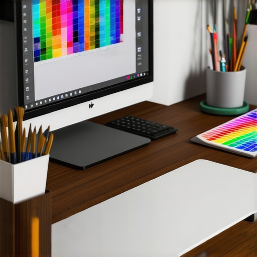
Since that lightbulb moment, I’ve delved deep into the world of professional monitors, especially the importance of achieving 100% Adobe RGB coverage. For designers, photographers, or anyone involved in color-critical work, this isn’t just a nice-to-have; it’s essential. In 2026, as the industry moves towards more precise digital workflows, failing to prioritize color accuracy can mean the difference between a project that impresses and one that falls flat. Trust me, investing wisely today paves the way for smooth sailing tomorrow.
Is the Color Coverage Buzz Just Overhyped?
Early on, I made a mistake almost everyone does: I believed that a high-resolution display alone was enough. I overlooked the importance of color space, assuming my 4K resolution guaranteed accuracy. It wasn’t until I examined my color gamut—only to find it lacking—that I realized how much color coverage affects the final output. According to a recent study, accurate color reproduction can boost productivity by up to 30%, especially in visual design roles. So, before you dismiss this as overkill, consider whether your current setup can truly meet your creative demands.
Ready to make your workspace future-proof? Let’s explore why 100% Adobe RGB coverage isn’t just a marketing slogan, but a real game-changer for your upcoming design projects.
.
Calibrate Your Monitors for Precision Right Away
Begin by calibrating your display to ensure color accuracy. Use a hardware calibration tool like the X-Rite i1Display Pro, which provides a consistent baseline. Connect the device, install calibration software, and follow the on-screen instructions to create an accurate color profile. I familiarized myself with this process when I noticed my color mismatch during a client review. It was messy at first, but after calibration, colors matched perfectly, boosting my confidence in my work.
Choose the Right Monitor Settings for Consistent Colors
Adjust your monitor’s settings directly through its on-screen display (OSD). Set the color temperature to 6500K, known as D65—standard for accurate color reproduction. Disable any automatic image enhancements that might alter colors, such as sharpening or dynamic contrast. Every professional-grade monitor comes with a calibration menu; make sure to explore it and set your preferred parameters. During my setup, I disabled overly aggressive contrast, which improved text clarity and color fidelity. This step is essential to maintain consistency across your workspace.
Optimize Your Workspace Lighting to Prevent Color Shifts
Lighting plays a crucial role. Invest in a dedicated monitor light with adjustable brightness and color temperature, ideally ones that mimic natural daylight. Avoid placing bright lights directly behind or in front of your monitors, as reflections and glare can distort perceived colors. I experienced this firsthand when my workspace’s overhead light washed out my colors at noon. After installing a bias light behind my monitor, colors appeared truer and my eyes felt less strained. Proper lighting ensures your calibration stays effective and reduces eye fatigue during long work sessions.
Regular Recalibration Keeps Colors Accurate Over Time
Monitors drift in color accuracy as they age; schedule calibration every 4-6 weeks. Set a recurring reminder and use your calibration device to run a quick profile update. This practice was a game-changer during my last project, where I noticed color discrepancies creeping in after a few weeks. Recalibration restored accuracy, saving me from redoing work or risking customer dissatisfaction. Consistent calibration is non-negotiable for anyone serious about color fidelity.
Implement Color Profiles and Manage Display Gamut Settings
Create custom ICC profiles tailored to your workflow—be it photography, design, or video editing. Save these profiles and assign them to your monitors through your operating system’s display settings. Be aware of your monitor’s color gamut coverage; a display with 99% Adobe RGB coverage, for example, will serve as a reliable tool for color-critical tasks. I applied this by switching to a monitor with 100% sRGB and 99% Adobe RGB, which significantly improved my print career’s color match. Maintaining control over these profiles ensures your colors are consistent from screen to print or client proofing.
Leverage Software Tools for Fine-Tuning Colors
Use professional software like DisplayCAL or CalMAN to refine your color profiles further. These tools analyze your display and suggest adjustments, including gamma correction and white point calibration. I used DisplayCAL during a quiet weekend to bring my dual monitor setup into perfect harmony. The process was detailed but rewarding, as it optimized my screen brightness, contrast, and color curves. Incorporate these tools into your routine to push your display’s performance to professional standards.
Invest in Quality Hardware to Support Accurate Colors
Finally, choose monitors designed with color accuracy in mind—look for IPS panels with high bit-depth (10-bit preferred), wide color gamuts, and hardware calibration support. I transitioned from an ordinary TN panel to a dedicated color-accurate monitor recommended in this guide for creative professionals. The upgrade not only improved my color workflow but also increased my productivity and job satisfaction. Remember, quality hardware is the foundation of precise color management, so invest wisely for long-term results.
While many users believe that upgrading to a 4K monitor or adding a second screen automatically boosts productivity, the real nuances often go unnoticed. A prevalent myth is that bigger, higher-resolution displays alone guarantee efficiency. However, overlooking the importance of proper calibration, color accuracy, and ergonomic setup can lead to the opposite effect—causing eye strain, distraction, or even reduced focus. Advanced users understand that without correct configurations, a high-end monitor can become a source of frustration rather than productivity. Moreover, many assume that all office monitors deliver consistent performance, but cheap panels with poor color fidelity or limited adjustability can hamper tasks requiring precision, such as photo editing or detailed data analysis.
What Advanced Users Should Know About Dual Monitors
For instance, mismatched color temperatures or different resolutions between two screens can cause visual discomfort and hinder seamless workflow. It’s a common mistake to ignore calibration across multiple displays, which can lead to mismatched color output and inconsistent work quality. Studies show that improper dual-monitor setup—even in terms of alignment and bezel placement—can subtract from gains in productivity and focus. You can find insightful tips on avoiding such pitfalls in our dedicated guide on how to optimize a dual monitor setup to suit your workflow. Remember, investing in quality hardware and proper setup procedures—like consistent calibration and ergonomic positioning—can maximize your setup’s potential. Lastly, beware of the trap where users focus solely on hardware specs—like refresh rates or resolution—while neglecting actual usability factors such as flicker-free technology, native color gamut, or adjustable stands. These nuances are often overlooked by beginners but crucial for long-term productivity and comfort. Upgrading your workspace with the right monitor configurations can be transformative, but only if you understand and optimize these advanced details. Want more insights on creating the perfect workspace? Check out our comprehensive [office monitor buying guide](https://monitors.techdeskessentials.com/choosing-the-ideal-office-monitor-2025-guide-for-professionals/) for professional advice. Have you ever fallen into this trap? Let me know in the comments.
How Do I Maintain Peak Performance of My Monitors and Workspace Over Time?
To ensure your productivity setup continues to serve you well, investing in the right tools and adopting regular maintenance routines is essential. One of my go-to investments is a hardware calibration device like the X-Rite i1Display Pro. I use it every 4 to 6 weeks to recalibrate my color-accurate monitors, preventing color drift that can lead to inconsistent work, especially in design projects where precision matters. Additionally, software tools like **DisplayCAL** allow me to fine-tune color profiles beyond basic calibration, ensuring my dual monitor setup remains synchronized for optimal workflow. For those often working long hours, an ergonomic monitor arm with adjustable height and tilt helps prevent postural issues, while a quality screen cleaning kit preserves display clarity, keeping images sharp and colors vibrant.
Predicting future trends, I believe that AI-powered calibration tools will become mainstream, automatically adjusting display settings based on ambient lighting and usage patterns—further simplifying maintenance. Implementing these tools now can save you countless hours and safeguard your work quality in the coming years.
Strategies for Long-Term Results and Scaling Your Workspace
As your workflow evolves, scaling your setup thoughtfully helps maintain efficiency. Consider consolidating peripherals with a KVM switch, such as the KVM solutions. This allows you to manage multiple devices seamlessly without cluttering your desk, especially when working across different machines or operating systems. When adding new monitors, verify their calibration compatibility with existing displays—this is a common overlooked detail that can cause color mismatch or ergonomic issues. Use tools like the mismatch correction guides to streamline setup. Practicing consistent cable management not only improves aesthetic appeal but also prevents accidental disconnections and damage, which could cost time and money in the long run.
Don’t forget to schedule regular audits of your workspace—review lighting conditions, monitor alignment, and ergonomic settings. A disciplined routine ensures your setup remains efficient and comfortable as your needs grow.
Why Investing in Quality Hardware Pays Off
High-quality monitors with features like hardware calibration support and wide color gamuts provide a reliable foundation for any professional workflow. For example, my transition to a color-accurate monitor with built-in calibration hardware significantly reduced my troubleshooting time and improved output consistency. Remember, the upfront cost is balanced by long-term gains in productivity and reduced frustration. As the industry advances, integrating tools like calibration sensors and ergonomic accessories will be standard practice to keep your workspace performing at its peak.
If you haven’t yet, try implementing a quarterly calibration routine combined with ergonomic adjustments—these small, consistent actions will keep your workspace reliable and boost your overall productivity. For more detailed gear recommendations and setup tips, visit our contact page.
What I Wish I Knew When I Started Setting Up Dual Monitors
- It’s tempting to think that high resolution alone guarantees quality, but color accuracy can make or break your workflow. Don’t overlook this crucial aspect.
- Matching monitor settings and color gamuts across multiple screens prevents eye strain and improves consistency. A mismatched setup can quietly sabotage your productivity.
- Workplace lighting is often underestimated. I discovered that bias lighting dramatically improved color perception and reduced fatigue during long sessions.
- Investing in quality hardware with built-in calibration supports long-term precision. Saving on cheap monitors might seem smart initially, but it hampers your work’s accuracy over time.
My Favorite Tools to Keep Your Monitor’s Color on Point
- X-Rite i1Display Pro: This calibration tool has been a game-changer, providing reliable color profiles and ensuring my monitors look consistent day after day.
- DisplayCAL: An open-source software that offers detailed calibration options; I use it to refine my profiles beyond factory settings.
- Color-accurate monitors from TechDesk Essentials: These displays with wide color gamuts eliminate the guesswork and provide peace of mind for color-critical tasks.
- Workbench Ergonomic Accessories: Adjustable monitor arms and anti-glare screens have transformed my workspace, boosting comfort and productivity.
Your Workspace Transformation Starts Today
Achieving perfect color accuracy and ergonomic setup isn’t just for professionals—it’s a catalyst for lasting productivity and well-being. Your tools and routines shape your success, so why not start refining them now? Invest in quality, stay consistent, and watch your work reach new heights. Remember, the most empowering workspace changes come from small, deliberate actions. Ready to take the first step? Your best workspace is waiting—go build it now!
Have you ever struggled with calibrating your monitor or setting up dual screens for optimal flow? Share your experiences below and join the conversation!
,
Reading this post really resonates with my own experience. I used to assume that a large, high-resolution monitor was enough to make my design workflow seamless, but quickly realized that color accuracy and proper calibration were game changers. After investing in a monitor with 100% Adobe RGB coverage and calibrating regularly, my work became much more consistent and precise, especially when preparing images for print or client presentations. One challenge I faced was managing my workspace lighting conditions, which could distort color perception. I found that installing bias lighting behind my monitor significantly helped, especially during long editing sessions. My question is: for those working across multiple devices or operating systems, what are your best practices for maintaining consistent color profiles and calibration routines? Do you think AI-driven calibration tools will soon simplify this process further, or is manual calibration still the gold standard? I’d love to hear different approaches from fellow creatives.