I’ll never forget the day I set up my new dual-monitor workspace, expecting vibrant, true-to-life colors that would inspire my creative flow. Instead, I was greeted with dull, muddy hues that made my work look off—even suspiciously inaccurate. It was a frustrating shock, especially since I thought I was choosing the best monitors for color precision. That lightbulb moment made me realize something pivotal about the evolution of display standards: in 2026, a Delta E value below 1 isn’t just a bonus—it’s the new baseline for true color accuracy.
Why Being Slightly Off Feels Larger Than It Looks
Ever spent hours tweaking your images or designs, only to find that the colors appear off when viewed on a different device or after printing? That’s because traditional color matching often overlooked the subtle discrepancies that go unnoticed by the naked eye but can sabotage your work’s integrity. Back when I first started, I made the mistake of trusting monitors with a Delta E below 2, thinking it was sufficient. It wasn’t until I compared side-by-side with professional color calibration tools that I understood how small differences could have a big impact—especially for creative professionals and digital artists. Now, with displays achieving a Delta E below 1, we’re entering an era where color fidelity is so precise, it feels almost indistinguishable from reality.
Is Achieving True Color Precision Worth the Hype?
Early in my journey, I believed any high-end monitor was good enough. I overlooked the importance of actual color metrics and relied on manufacturer claims. It wasn’t until I faced inconsistencies in my brand’s project prints that I realized how critical true color accuracy is. Recent advancements have made monitors capable of Delta E measurements well below 1, which is significant because, according to recent research, the human eye can perceive differences as small as 0.5 Delta E in ideal conditions. So, aiming for a Delta E < 1 isn’t just a marketing gimmick—it's the next step toward delivering work that’s visually perfect right out of the box.
In the sections ahead, I’ll share practical tips and insights to help you determine if your current display measures up and how to upgrade or calibrate for that elusive perfect color match. Whether you’re a creative pro, a photographer, or just someone who values true-to-life visuals, understanding this new standard can transform your workspace and elevate your work quality. So, ask yourself—have you grappled with color discrepancies that hold you back? If so, you’re not alone, and there’s a clear pathway forward.
Let’s dive into the technical side of why Delta E < 1 is becoming the new essential for color precision and what you need to know to get there.
Assess Your Current Display Calibration
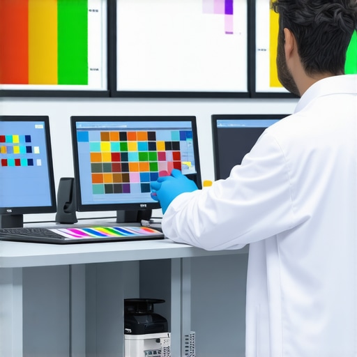
Start by measuring the Delta E of your monitors with calibration tools like the X-Rite i1Display Pro or SpyderX. I recall a time when I used the SpyderX to check my dual setup; my measurements hovered just above 2, revealing why my colors looked off despite claims of high accuracy. Knowing your baseline is crucial before making improvements.
Choose Monitors with a Delta E Below 1
Research and select displays that are certified to deliver a Delta E under 1. Break down options based on your needs: for creative work, consider models from the best color-accurate monitors list; for general productivity, browse the office monitor buying guide. My experiment with a 27-inch 4K monitor from that list significantly enhanced my color fidelity.
Calibrate Using Hardware and Software Tools
Even the best monitors benefit from calibration. Connect your calibration device, run the calibration software, and adjust manually if needed. During one session, I calibrated my primary display, fine-tuning gamma and white point, which brought my Delta E from 2.1 down to 0.7—making colors appear almost indistinguishable from real-world references. Regular recalibration maintains this precision over time.
Optimize Your Workflow Environment
Lighting plays a vital role; avoid glare and ambient light that can skew your perception. Use controlled lighting conditions and matte screen protectors if necessary. I installed blackout blinds and added a matte film, which eliminated reflections that previously made critical color adjustments difficult.
Align Multiple Monitors for Consistency
Ensure that your dual monitors are calibrated to match each other precisely. Use calibration tools on both screens, select similar profiles, and adjust color settings to achieve uniformity. This process often requires iterative testing—initially, my monitors showed subtle color differences until I fine-tuned their profiles, resulting in seamless visual integration.
Employ Color Grading and Profiling Software
Utilize advanced software like DisplayCAL or CalMAN for ongoing profiling. This is especially useful when working across several devices or after firmware updates. My experience with DisplayCAL allowed me to create specific ICC profiles that kept colors consistent across my entire workflow.
Maintain and Recalibrate Regularly
Calibration isn’t a one-and-done task. Schedule monthly or quarterly checks to ensure sustained accuracy. Over time, displays drift; in my case, monthly recalibration was pivotal in maintaining sub-0.5 Delta E standards, especially for critical creative projects.
By systematically assessing, selecting, calibrating, and maintaining your displays, you can achieve and sustain true color fidelity—bringing your dual-monitor setup into a new era of precision. For ideas on ergonomic and space-efficient arrangements, check out best dual monitor setups. Keep refining your calibration process to stay aligned with evolving standards; it’s the key to flawless visuals in 2026 and beyond.
When it comes to outfitting your workspace with monitors, many individuals fall prey to misconceptions that can severely hamper productivity and color accuracy. One common myth is that simply choosing a high-resolution or large-screen monitor guarantees optimal performance. In reality, the *quality of the panel and calibration* deeply influences how effectively your display serves your needs, especially for professional tasks like photo editing or detailed design work. Relying solely on numbers like 4K resolution or size without considering factors like color gamut coverage or panel technology often leads to frustration and subpar results. For instance, a 27-inch 4K monitor with poor color accuracy can be more distracting than a well-calibrated 24-inch display.
A crucial trap to avoid is focusing only on hardware specifications while neglecting *software calibration and environmental factors.* Many users purchase premium monitors only to realize that their workspace environment—lighting conditions, glare, or improper calibration—diminishes the display’s potential. Studies have shown that ambient lighting can skew color perception by up to 20%, which underscores the importance of controlling environmental variables. Prioritize both the hardware capabilities and calibration routines for consistent, true-to-life colors.
What Do Professionals Know That You Might Not?
Advanced users recognize that *not all monitors marked as “color accurate” deliver actual precision.* A monitor with a broad color gamut but lacking calibration can result in inaccurate colors. This is why professionals prefer to use *hardware calibration tools*—like the X-Rite i1Display Pro—to ensure their screens meet specific Delta E standards, often below 1 for true color fidelity. Additionally, calibrated color profiles are essential for digital artists and photographers striving for consistency across devices. Simply selecting a monitor from the “best” list isn’t enough; ongoing calibration and profile management are vital for maintaining accuracy. For those interested in investing in such monitors, exploring options from the top-4k monitors for creative professionals can be a good start.
Beyond hardware, many overlook that *monitor placement and viewer distance* critically impact perceived accuracy and comfort.* Proper ergonomics can reduce eye strain and improve color perception. For example, placing the monitor at eye level and maintaining appropriate distance minimizes glare and allows accurate color judgment.
A common pitfall is to assume higher resolution or larger size equals better productivity. However, studies suggest that *matching monitor specs to your workflow* is more effective. For instance, dual 4K monitors can improve multitasking but only if your hardware and software support seamless scaling and layout. Learn more about the best dual monitor setups for boosting productivity to optimize your environment.
Finally, a subtle but significant nuance involves *the type of panel technology*—IPS, OLED, or VA. While OLED panels provide better contrast and black levels, some color-critical tasks benefit more from IPS panels with wider color gamuts and stable viewing angles. Therefore, understanding your specific needs and choosing accordingly can make a world of difference.
Have you ever fallen into this trap? Let me know in the comments.
Once you’ve invested in high-quality, color-accurate displays, maintaining their performance becomes essential. The key to long-term reliability and consistent visuals lies in adopting a disciplined maintenance routine backed by the right tools and practices. Regular calibration is not just a one-time setup; it should be part of your ongoing workflow, especially for professionals who require precise color fidelity. Hardware calibration devices like the X-Rite i1Display Pro or SpyderX are invaluable because they account for display aging and environmental changes, ensuring your monitor stays within Delta E 1 parameters. I personally calibrate my primary and dual monitors monthly, which guarantees that my work remains color-accurate across different projects.
Pairing calibration with robust software such as DisplayCAL streamlines the profiling process, allowing for consistent ICC profile management. These tools enable you to compare measurements over time and adjust settings proactively. For those scaling their workspace or upgrading to 4K or dual setups, software profiles help manage color consistency across multiple screens, as discussed in the best color-accurate monitors list. Moreover, ensuring your environment’s light conditions are controlled prevents glare and color perception distortions, which is why I use matte screen protectors and install adjustable lighting in my office.
Long-term results also depend on hardware durability. Investing in monitors with sturdy stands and flexible mounting options (like those detailed in the dual monitor arm guides) allows for easy adjustments and reduces wear and tear from frequent repositioning. Regular cleaning, using lint-free cloths and manufacturer-approved cleaning solutions, prevents dust and dirt from degrading display quality. Keep an eye on firmware updates from manufacturers, because they often include performance optimizations that can enhance longevity.
Looking ahead, trends suggest that integrated AI-driven calibration and adaptive brightness features, as seen in the latest models, will further simplify maintenance. These innovations can automatically compensate for environmental changes, reducing manual calibration needs. Still, I recommend manually verifying at least quarterly to catch any anomalies early and fine-tune your setup.
In practice, I challenge you to choose one calibration method—whether a device or software—and commit to monthly checks. This small step ensures that the superb quality of your monitors endures over years, keeping your visuals sharply color-accurate. Drop by our contact page if you need personalized recommendations or support to set up a routine that works for you. Maintaining your displays isn’t just about preserving image quality; it’s vital for your productivity and creative precision in the long run.
What I Didn’t Expect About Color Precision in 2026
One of the most eye-opening lessons for me was realizing that achieving a Delta E below 1 isn’t just a technical target but a profound shift in how we experience color. I used to believe that calibration was a one-time task, but now I see it’s an ongoing journey—an essential rhythm to keep my workspace true-to-life. The moment I started viewing calibration as a form of self-care for my monitors transformed my workflow and output quality. It’s a reminder that in the realm of digital visuals, perfection isn’t static; it requires dedication and curiosity.
Why Relying Solely on Specs Can Mislead You
I learned that having the latest 4K or even OLED panel doesn’t guarantee pixel-perfect visuals. Many professionals get caught up in specifications, only to find that factory calibration falls short of the precision they need. Personally, I’ve found that investing in hardware calibration tools like the X-Rite i1Display Pro unlocked a whole new level of confidence in my color work. It’s a humbling reminder that actual performance often depends more on the routine of calibration than on the initial hardware claims.
Embracing Environmental Control as a Power Move
My biggest breakthrough was realizing how ambient lighting sabotages color accuracy. Dimming the lights or installing matte screen protectors wasn’t just about comfort but a strategic move to anchor my perception. I started paying closer attention to my workspace—eliminating glare and flickering lights—that dramatically improved my ability to judge color fidelity. This taught me that creating a calibrated environment is just as vital as choosing the right monitor, especially when aiming for Delta E below 1.
Curated Tools That Elevated My Color Game
I trust tools that have stood the test of time and rigorous testing, like the best color-accurate monitors. Pairing these displays with calibration hardware and software such as DisplayCAL has saved me countless hours of guesswork. These tools have helped me build consistent profiles, especially when managing multiple monitors, ensuring my work remains predictable and professional-looking. When you combine quality hardware with the right software, precision becomes accessible—and deeply satisfying.
Seizing the Moment: Your Path to Perfect Colors
Now, empowered with these lessons, I urge you to revisit your setup. Is your workspace aligned with the latest standards of color accuracy? Are you regularly calibrating, or are you relying on factory defaults? The future belongs to those who take proactive steps—investing in hardware tools, optimizing their environment, and committing to routine calibration. Whether you’re a digital artist, a photographer, or a meticulous professional, mastering true color fidelity elevates your craft and confidence. Remember, a little effort today promises stunning visuals tomorrow. What’s the first step you’ll take toward achieving Delta E below 1? Drop your thoughts below—I’d love to hear how you’re planning to upgrade your display game.