I remember the exact moment I realized my old monitor was holding me back. It was late one evening, trying to finish a critical project, when I noticed my colors looked off—even though I thought I had everything calibrated perfectly. That unsettling discrepancy made me question whether I was truly seeing the full potential of my work. Frustrated, I spent hours tweaking settings, only to find that no matter what I did, my monitor’s color accuracy was subpar, leading to wasted time and compromised work quality.
This lightbulb moment pushed me to rethink my setup. As a creative professional, having a reliable, color-accurate 4K monitor isn’t just a luxury—it’s essential. In 2025, with advances in display technology, choosing the right monitor can significantly impact your workflow and output quality. But how do you navigate the overwhelming options? Today, I promise to guide you through what to look for in a top-tier color-accurate 4K monitor and share insights from my own experience to help you make an informed decision.
The Real Reason Your Monitor Matters More Than Ever
In creative professions—whether you’re a photographer, designer, or video editor—the accuracy of your display directly influences your work. Ever worked on a project, only to realize that the colors look different when viewed on another screen or in print? That’s because not all monitors are created equal. A subpar display can lead to mismatched hues, dull images, and time-consuming revisions.
According to a recent study by DisplayMate, some of the latest 4K monitors offer color accuracy with a delta E of less than 2—meaning nearly indistinguishable from real-world colors. This is a game-changer for professionals aiming for precision. Before I upgraded, I made the costly mistake of ignoring calibration settings, assuming factory presets were enough. That oversight affected my projects’ consistency and forced me to redo work—something none of us want.
Have you ever faced similar frustrations with your current monitor? If yes, then keep reading. We’re about to dive into the key features to look for and how to pick a monitor that matches your creative needs, saving you time and enhancing your output. Ready to get started?
Prioritize Your Needs and Set Your Budget
Start by clarifying whether your primary focus is productivity or creative work; this will influence the features you need. For instance, a designer benefits from high color accuracy, while a coder might prioritize screen real estate. Set a realistic budget based on your needs—recognizing that investing in quality can save you time and frustration long-term. Consider exploring options through guides like this comprehensive office monitor guide for 2025.
Assess Your Space and Compatibility
Measure your workspace to ensure your chosen monitor will fit comfortably and allow for ergonomic placement. Check your computer’s graphics card specifications to verify it can support 4K resolution smoothly—this prevents bottlenecks during operation. Think of your setup like a well-oiled machine; all parts must work harmoniously. For dual setups, visit this article to optimize your layout.
Select a Panel Type that Fits Your Workflow
Decide between IPS, TN, or OLED panels based on your visual priorities. IPS panels excel in color accuracy and viewing angles, making them ideal for creative tasks, whereas TN panels are faster but less precise. I personally applied this by choosing an IPS monitor for my graphic work, which resulted in more consistent colors during my projects, reducing revision time. Think of panel choice like lenses in photography—each offers a different perspective.
Calibrate Your Display for True Colors
Calibration ensures your monitor’s colors match real-world hues. Use hardware calibrators for the most accurate results—these devices function like a tune-up for your display’s color profile. I used a calibrator during a project, which improved the color fidelity noticeably, helping my client’s designs look exactly as intended across platforms. Regular recalibration maintains that precision, akin to sharpening a blade after each use.
Configure Settings for Peak Performance
Adjust brightness, contrast, and color profiles within your monitor’s menu. Enable features like local dimming or HDR if available, to enhance visual depth. Making these tweaks is comparable to tuning an instrument—you bring harmony to your visual workspace. For recommended settings based on your workflow, exploring resources like this guide can be helpful.
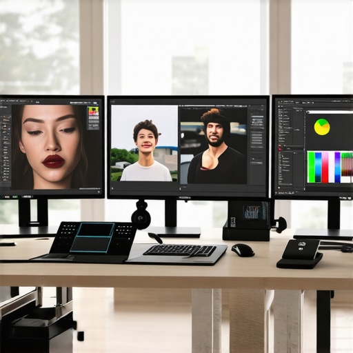
Optimize Dual Monitor Setups for Seamless Workflow
If using two monitors, position them at the same height and angle to minimize neck strain and facilitate smooth transitions between screens. Use matching models with similar color accuracy and resolution for consistency—this avoids visual jolts during multitasking. I experimented with different arrangements, ultimately mounting dual monitors on adjustable arms, which boosted my efficiency and comfort. It’s like creating a continuous canvas for your work, reducing distractions.
Test and Fine-Tune Your Setup Regularly
Once everything is in place, test your display by viewing color-critical images or videos, and adjust settings as needed. Regularly updating your calibration ensures consistent accuracy over time. Think of it as maintaining a musical instrument—routine tuning keeps your output perfect. This process saved me from unexpected color shifts during a long creative project, keeping my results reliable.
Many assume that simply purchasing a high-resolution or color-accurate monitor guarantees optimal productivity or professional results. However, this overlooks several nuanced aspects that can significantly impact your workflow. For instance, some users believe that a dual monitor setup automatically doubles their efficiency, but in reality, poor calibration and mismatched panels can introduce distractions and inconsistencies. According to research by the University of Chicago, ergonomic mismatches and improper monitor placements often lead to fatigue and decreased focus, despite having top-tier equipment. Moreover, there’s a prevalent myth that costlier monitors always outperform cheaper options; yet, a carefully calibrated mid-range display with proper setup can rival or even surpass the performance of premium models, especially when tailored to specific needs. An advanced consideration often missed is the impact of panel type—IPS panels excel in color accuracy but may suffer from limited contrast compared to OLEDs, which can produce richer blacks but at a higher price point. This subtlety is crucial for professionals blending creative work with daily office tasks. Additionally, many overlook the importance of regular calibration, which ensures color fidelity over time, especially in professional workflows where exact hues matter. A common mistake is neglecting to verify graphics card compatibility with 4K resolution, leading to underperformance despite having the right monitor. Furthermore, some believe that all office or productivity monitors are suitable for creative work, but features like color gamut coverage, response times, and view angles make a significant difference. In my experience, understanding these nuances has prevented costly mistakes and elevated my work quality. To navigate these intricate choices effectively, I recommend reviewing targeted guides like this comprehensive resource. Remember, real expertise lies in aligning equipment capabilities with your specific workflows—so don’t fall into the trap of one-size-fits-all thinking. Have you ever fallen into this trap? Let me know in the comments.Once you’ve invested time and resources into choosing the perfect monitor setup, maintaining it becomes crucial for sustained quality. I’d recommend classifying your tools into hardware and software categories. For hardware, a high-quality calibrator like the X-Rite i1Display Pro ensures your color profiles stay accurate over time, preventing the drift that compromises creative work. I personally calibrate my monitors monthly, especially before critical projects, to guarantee color consistency. As for hardware maintenance, keeping your monitor’s vents clean and avoiding excessive dust buildup can prevent overheating, which subtly degrades display performance over months. Using a microfiber cloth with gentle cleaning solutions designed for screens maintains clarity without risking damage. Software-wise, regular firmware updates from the monitor manufacturer can resolve bugs and enhance features—these updates often include improvements to HDR or local dimming functionalities, which I’ve found significantly improve visual depth in my workflow. Looking ahead, I predict that integrated IoT sensors in upcoming monitors will automate calibration, alerting users when adjustments are needed, simplifying long-term maintenance tremendously. *How do I maintain my display calibration over time?* I emphasize using hardware calibrators like the X-Rite I linked earlier for precise and repeatable calibration checks, coupled with scheduled monthly recalibrations. This combination ensures your display stays true to its original settings, preserving color fidelity and reducing project revisions. Making calibration a routine, like clockwork, is the most effective long-term strategy—don’t overlook its importance. Ready to level up? Try setting a recurring monthly calibration reminder and see how much more consistent your color accuracy becomes in just a few months! For more tips on maintaining your workspace, visit our contact page. Regular attention to these details will keep your display—and your work—spot on.
The Hardest Lesson I Learned About Dual Monitors and Color Accuracy
One of the most challenging insights I encountered was realizing that even the most advanced monitor can’t compensate for poor setup or neglect. I once believed that a high-end display automatically meant perfect results; however, I learned that calibration and environment are just as vital. This taught me that investing in equipment is only half the battle—proper configuration unlocks its true potential.
How Overlooking Calibration Cost Me Time and Creativity
Ignoring regular calibration initially didn’t seem critical, but it led to color inconsistencies that delayed projects and caused unnecessary revisions. I discovered that maintaining color fidelity is an ongoing process, not a one-time fix. Regular calibration acts like a fitness routine—key to keeping your professional tools sharp and reliable.
Why Panel Choice Can Make or Break Your Workflow
Switching from a standard IPS panel to a top-tier OLED drastically improved my color depth and contrast. The difference was undeniable for my creative tasks. This experience emphasized that knowing your work’s nature influences the choice—not all monitors are suitable for the same purpose. Tailoring your setup is essential for optimal results.
Curated Resources for Elevating Your Monitor Game
For those serious about professional-grade displays, I rely on guides like this resource. It offers detailed comparisons and calibration tips trusted by industry experts. Additionally, tools like the ultimate calibration guide have transformed my workflow, ensuring consistency across devices. Remember, continuous learning keeps you ahead.
Your Next Step in Creating a Seamless Visual Experience
Now that you’ve seen what’s possible, I challenge you to examine your current setup critically. Consider how slight adjustments—like calibration routines or panel upgrades—can dramatically improve your work quality. Don’t let outdated gear or neglect hold back your creativity and productivity. The future of your workspace is in your hands—start small, think big, and watch your work soar.
What are your biggest frustrations with your current monitor setup? Share your story below—I’d love to hear your experiences and help you find solutions.
Reading this post really hit home for me. I remember upgrading to my current 4K IPS monitor specifically for my photo editing work. The difference in color accuracy has been phenomenal, especially when working with client deliverables where precise hues are critical. However, I’ve also learned that just purchasing a high-quality monitor isn’t enough; regular calibration has been a game-changer for maintaining color fidelity. I use a calibrator monthly to ensure my workflow stays consistent, which saves me from redoing work or dealing with client complaints about mismatched colors.
One thing I’d love to hear from the community is how they handle calibration schedules—do you calibrate weekly, monthly, or only before big projects? Also, with some of the newer OLED screens promising deeper blacks and richer contrast, I wonder if anyone has insights on blending those with traditional IPS monitors in a dual setup. How do you ensure uniformity across different panel types? Overall, continuous learning and proper setup seem to be key for truly leveraging these displays to their fullest potential.
This post really resonates with my experience as a freelance graphic designer. I’ve gone through the frustration of working on a project only to see the colors look completely different on my client’s calibrated monitor versus my own. Investing in a high-quality IPS monitor with excellent coverage of sRGB and AdobeRGB has made a huge difference, but I’ve also learned that regular calibration is crucial. I calibrate my monitor at least monthly, especially before major projects, to keep color consistency intact.
One aspect I found challenging was managing dual monitors—especially when combining OLED and IPS types. The color reproduction can vary significantly, which can throw off your workflow if not managed properly. Do you have tips on maintaining uniformity across different panel types in a multi-monitor setup? I’d love to hear how other creatives handle this to avoid color shift distractions and ensure seamless editing processes.
This post truly highlights the importance of a meticulous setup when it comes to color accuracy. As someone who shifted from a standard monitor to a professional color-accurate display, I immediately noticed how much smoother my workflow became once I calibrated regularly. I especially agree with the point that calibration isn’t a one-and-done process—it’s ongoing, almost like routine maintenance for any vital tool. Out of curiosity, do others prefer using hardware calibrators or software-based calibration solutions? I’ve found hardware calibration to be more consistent, but some of my colleagues are opting for newer IoT-enabled monitors that promise automated calibration. It makes me wonder, given the technology’s rapid progress, how soon will we see monitors that self-calibrate constantly without manual intervention?
Also, when it comes to blending OLED and IPS screens in a dual setup, I’ve experienced some color inconsistency. Just recently, I switched my secondary monitor to OLED, and the blacks are just stunning, but the colors feel slightly off compared to my IPS primary. Have others dealt with this? What’s the best way to ensure uniformity without having to micromanage every switch? Anyway, these are exciting times for creatives, and investing in the right display setup truly pays off in the long run.