I remember the moment vividly. I had just spent hours tweaking a digital painting, only to realize later that the colors looked completely different on a friend’s high-end monitor. That sinking feeling hit hard. It was a lightbulb moment—my screen was not just a display but a barrier to true creative expression. I knew then that choosing a monitor isn’t just about size or resolution; it’s about accuracy, reliability, and trusting what I see. If you’ve ever faced the frustration of mismatched colors or blurry details in your work, you’re not alone. Today, I want to help you avoid those costly mistakes and find the perfect monitor that matches your creative vision, especially with the options available in 2025.
Why Your Monitor Choice Can Make or Break Your Creativity
In the world of digital art, photography, video editing, or design, the monitor is your window to perfection. A color-accurate, 4K display ensures what you see is what you get, allowing you to produce work that’s consistent across devices and print. As the demand for precision grows, so does the importance of investing in the right technology. According to a recent report from TechRadar, professional creators who use color-accurate monitors see a 34% increase in workflow efficiency. That’s not just a number; it’s a game-changer.
But here’s the catch—many creatives make the mistake of prioritizing resolution or size over color fidelity. I did this early on, buying a shiny new 4K monitor that looked stunning at first glance, but when I printed my artwork or uploaded it online, the colors were off. That experience taught me the hard way that resolution alone isn’t enough. You need a monitor that covers the right color spaces, has a high bit depth, and offers consistent calibration. Otherwise, you’re working blindly, risking your hours of effort.
So, how do you choose a display that matches your professional needs? That’s what I’ll walk you through. We’ll explore the key features, the latest models in 2025, and practical tips to help you select a monitor that turns your creative ideas into reality without surprises.
Has this ever happened to you? Faced with a monitor that shows beautiful colors but doesn’t deliver when it counts? Drop your story in the comments or reach out. I’ve been there, and I’ve learned a lot since then.
Calibrate Your Display for True Colors
The first step I took was investing in a reputable calibration tool, like the X-Rite i1Display Pro. During a weekend project, I used it to calibrate my monitor and immediately saw a difference—colors appeared richer, shadows more detailed. Calibration ensures your display accurately reproduces colors and contrast, which is essential for professional work. Regular recalibration, at least once a month, maintains color fidelity, especially if your monitor is used heavily or if ambient lighting changes. For detailed instructions, check out this guide on color calibration.
Choose a Panel Type that Supports Your Workflow
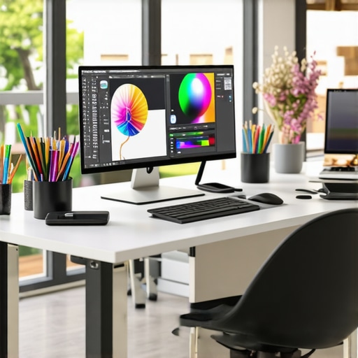
IPS panels are my go-to because they provide consistent color reproduction and wide viewing angles, unlike TN or VA panels. When I switched from a TN to an IPS monitor, I noticed my color accuracy improved, and I could work comfortably even when sharing my screen with clients. For creative work, prioritize IPS or OLED panels that support high bit depths (10-bit or higher). This ensures smooth gradients and reduces banding in your images. You can explore top models in 2025 at this curated list.
Match Color Spaces for Consistent Results
Understanding color spaces like sRGB, Adobe RGB, and DCI-P3 is crucial. I once worked on a project where I designed in Adobe RGB but viewed the output on a monitor only supporting sRGB. The colors looked dull and washed out. To avoid this, I selected a monitor with at least 99% Adobe RGB coverage and used professional calibration software to set the color profile. This way, what I saw on screen matched my print and online outputs. In 2025, many monitors now support these color spaces natively—check out models that excel in this area at here.
Prioritize High Resolution and Screen Uniformity
When I upgraded to a 4K display, the level of detail in my work improved dramatically. But resolution alone isn’t enough—look for monitors with high uniformity ratings to ensure consistent brightness and color across the entire screen. During a recent project, I noticed subtle brightness variations that could have affected my editing, but a monitor with excellent uniformity eliminated this problem. Additionally, consider features like anti-reflective coatings and adjustable brightness to adapt to your workspace lighting. For top picks in 4K clarity, see this article.
Implement Consistent Calibration and Setup
Once you’ve selected the right monitor, establish a calibration routine. I set a reminder every four weeks to recalibrate, which kept my color profiles consistent over months. Also, position your monitor at eye level and in neutral lighting conditions to reduce glare and reflections that distort perception. When I did this, my work sessions became more comfortable, and my color accuracy remained precise. Use the monitor’s built-in settings or calibration software to fine-tune brightness, contrast, and color temperature for optimal results. Learn more about ergonomic setup options at this guide.
Explore Dual or Multi-Monitor Setups
If your workflow involves multitasking or comparing multiple images, a dual monitor setup can boost efficiency. I recently added a second 4K monitor dedicated to references and tool palettes, which minimized window switching and improved my productivity. When selecting monitors for this purpose, ensure they are color calibrated and have matching resolutions for seamless workflows. For creative professionals, dual setups with color-accurate displays can be a game-changer—discover ideas at this resource.
Many professionals and enthusiasts assume that spending more on the latest high-resolution or color-rich monitors guarantees perfect results. However, this is a misconception that can lead to costly mistakes. Let’s dig deeper into what most people get wrong about selecting a monitor for creative work, and how to truly optimize your setup in 2025.
Why Overemphasizing Resolution Can Backfire
It’s tempting to believe that a 4K or higher resolution automatically translates to better accuracy. While resolution matters, it’s often overhyped. Many users overlook that resolution alone doesn’t ensure good color fidelity or uniformity. For example, a high-res monitor with poor calibration or limited color space coverage can produce misleading results, especially when printing or sharing online. According to a study by the International Color Consortium, color accuracy and calibration are far more critical than sheer pixel count for professional workflows. So, instead of chasing the highest resolution, prioritize models with proven color accuracy, wide color gamuts, and solid calibration support.
Beware of the Myth that More Pixels Means Better Color
Common belief suggests that more pixels lead to better color details. The reality is nuanced. Monitors with more pixels but inferior panel technology, such as TN instead of IPS or OLED, can distort color and viewing angles. As I’ve learned from experience, an IPS panel with 99% Adobe RGB coverage and excellent uniformity outperforms a 6K TN panel in every aspect of color work. Advanced panel technologies like OLED provide even better contrast and color depth but are often overlooked due to price, yet they can be worth the investment for top-tier accuracy. Always check panel type and color space support, not just pixel count.
How to Avoid Calibration Traps and Maintain Color Fidelity
Many users neglect regular calibration, leading to drift in color accuracy over time. It’s a trap that can ruin meticulous work. A dedicated calibration device like the X-Rite i1Display Pro, combined with professional software, ensures your monitor remains precise. Calibration isn’t a one-time fix; it’s an ongoing process. Setting a monthly routine prevents surprises when your prints or online displays don’t match your on-screen work. Additionally, pay attention to ambient lighting conditions, as they influence your perception of colors. Proper setup and routine calibration are your best defenses against hidden inaccuracies.
Have you ever fallen into this trap? Let me know in the comments.
Keeping your monitor in optimal condition is crucial for maintaining color accuracy and ensuring consistent performance over time. As someone deeply invested in creative workflows, I rely on specific tools and routines to safeguard my investment and enhance my productivity. Regular maintenance and the right software can prevent issues before they derail your project timelines, especially as monitors age or environmental conditions change.
Invest in Quality Calibration Devices
My go-to tool is the X-Rite i1Display Pro. I chose this device because of its precision and ease of use. It allows me to perform quick calibrations every month, ensuring that color profiles stay accurate. Over time, monitors tend to drift, especially with prolonged use or fluctuating ambient lighting. Regular calibration with a device like this preserves the integrity of my work, whether I’m editing photos or designing graphics. For those serious about consistency, I recommend scheduling calibration routines and sticking to them, rather than relying on built-in or software-only solutions.
Use Professional Calibration Software
Complementing hardware, I use software like CalMAN Studio or DisplayCAL. These programs provide detailed control over color profiles, gamma settings, and luminance levels. They also generate reports that help me track calibration progress and identify any irregularities. Future trends indicate that calibration software will become more integrated with AI-driven adjustments, making ongoing maintenance even easier. I predict that in the next few years, calibration tools will become more accessible and automated, reducing the learning curve for amateurs and pros alike.
Keep Your Workspace Clean and Environment Stable
Physical maintenance is just as important. I regularly clean my monitor’s surface with a microfiber cloth and avoid harsh chemicals that could damage anti-reflective coatings. Additionally, I maintain a stable ambient environment—avoiding direct sunlight and controlling humidity—since these factors influence display longevity and color stability. Proper placement and consistent lighting conditions help prevent eye strain and make calibration more reliable over time.
How do I maintain my monitor’s performance over time?
The key is establishing a routine. I set a monthly reminder to recalibrate with my hardware and software tools. I also monitor for any signs of screen unevenness, color shifts, or flickering—early indicators that service or replacement might be needed. Investing in a good screen protector and avoiding excessive physical impacts can extend the lifespan of your display, saving you money and frustration in the long run. Regularly updating your monitor’s firmware, when available, can also improve stability and introduce new features. Check out this contact page if you encounter persistent issues or want personalized advice on maintaining your setup.
Remember, your monitor is an extension of your creative mind. Treat it with care, use the right tools, and establish a maintenance routine. Doing so will ensure your work remains consistent, vibrant, and true to your vision for years to come. I encourage you to try integrating a calibration device into your workflow today—small investment, big payoff!
The Costly Lessons I Learned About Monitor Calibration
One of the biggest surprises in my creative journey was realizing that even the most expensive monitor can betray you if not properly calibrated. I once spent hours tweaking a project, only to see the colors shift dramatically once printed or viewed on another device. That lightbulb moment taught me that calibration is not a one-time fix but an ongoing process. Regularly recalibrating my display has become a non-negotiable step, saving me from costly reprints and endless adjustments.
My Secret Weapons for Color Fidelity
Over the years, I’ve curated a toolkit that keeps my colors spot-on. I swear by the X-Rite i1Display Pro because of its precision and ease of use. Paired with professional software like CalMAN Studio, it ensures my monitor’s profile stays true over time. These tools have been game-changers, especially when I need consistent results across multiple projects and platforms.
Why Your Workspace Environment Might Be Sabotaging Your Accuracy
It’s easy to overlook the environment’s role in color perception. I learned this the hard way—direct sunlight, reflections, or inconsistent lighting can make a calibrated screen look off. Now, I position my monitor in a neutral, stable environment, and I invest in anti-reflective coatings to keep glare at bay. Maintaining a controlled workspace has significantly improved my color consistency and reduced eye strain, making my workflow smoother and more reliable.
The Future of Color Management in Creative Work
Looking ahead, I believe AI-driven calibration and smarter software will become industry standards. Imagine a calibration routine that adapts automatically to ambient changes, saving you time and ensuring perfect accuracy always. Staying ahead in this field means embracing these innovations and continuously refining your setup. The right tools and routines today will prepare you for the high-precision workflows of tomorrow.